Research
Before starting this and the Platform Modernisation project, myself and the UX team researched other company design systems and potential component libraries we could use to improve the speed of development.
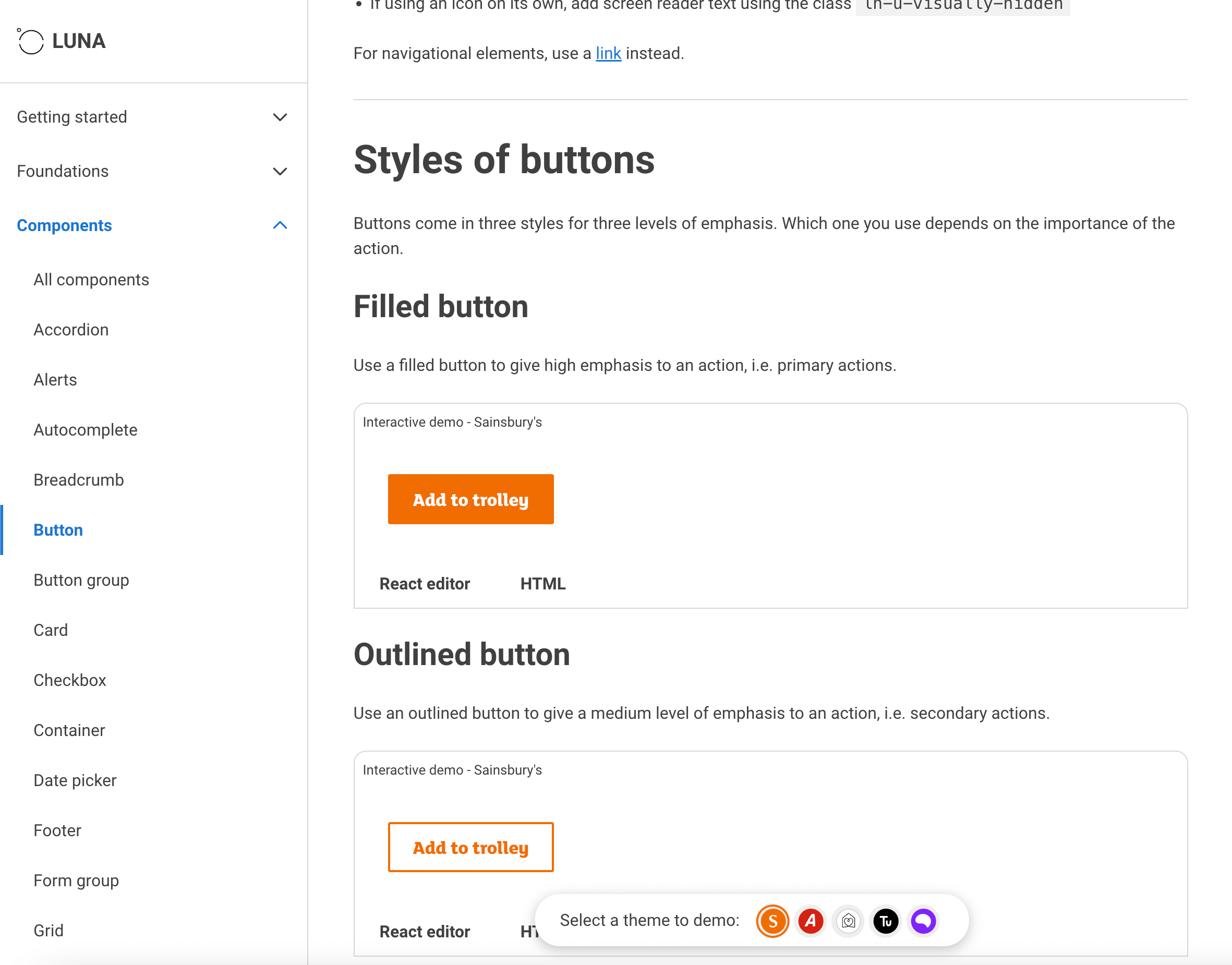
We looked into existing design systems from other e-commerce companies. We took notice of the headless design system used by Sainsbury’s that allowed for all the companies that use their system to adapt all components to match with their brand identity. We used a similar approach tokenising typography and colours and applying variables to border radiuses.
To improve development of Platform Modernisation, the EPM design system implored to use the MUI Component Library. The Components were taken from the MUI library and adapted to align with the current design styles of Next and Total Platform websites. With the MVC design system, a similar approach was needed, but with it being used to alter existing code instead of a fully re-written site there were several differences and restrictions.
To help with the production of the MVC Design System library I took a course on Design Systems with Memorisely. This helped to make sure we were using best practices for building the design system. After completing the course I fed back this information to the rest of the UX design team to help them better understand how to take part in the build in the design system.
Initial Designs and Refinement
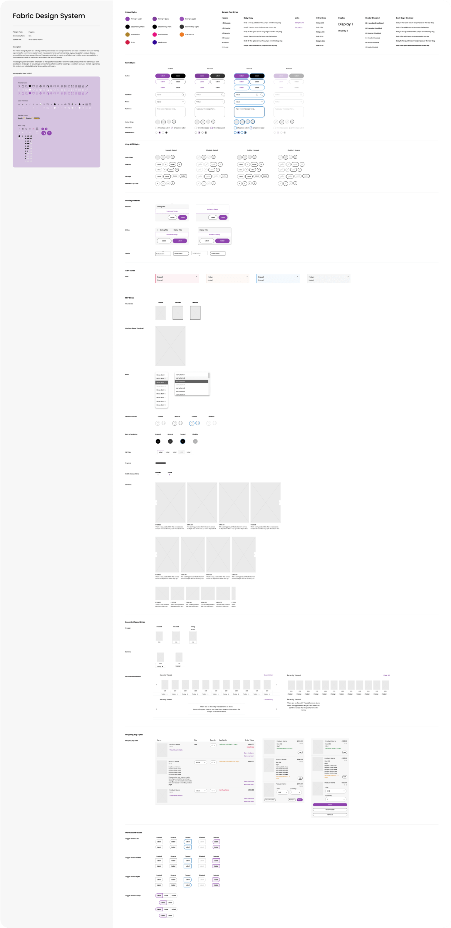
When starting the initial design phase for the MVC design library I took a cut of the EPM library that I had been previously working on to try and align the tokens as much as possible. The MVC library had more restrictions to it as it had to work with legacy code on the current live build, whereas EPM was going to be built from the ground up using React. With that understanding, MVC had to cover a lot more than EPM did with many more components already existing on the live site. Once the components were all created and tokens assigned, each component had to be reviewed once more to try and make sure only necessary new tokens were made. After the design library was made an overview was added so it could give the designer a quick view of how all the components look when a new theme is applied. Whilst this library was only for style amends, I did add the ability to add varying values for the border radius using variables.
Final Design and Implementation
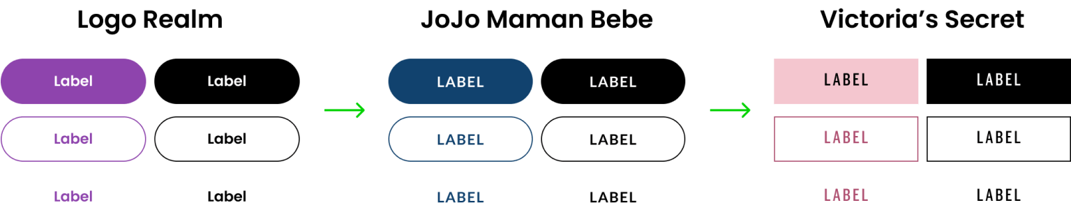
Whilst the design system was completed for a release, Next and Total Platform are currently in the process of refactoring the development of this and creating a new template. Currently only JoJo Maman Bebe takes advantage of the MVC design system for its PDP, Shopping Bag, Favourites, Store Locator, eGift Card and the Newsletter Component. The release offered an immediate improvement by simply offering hover states on buttons, which weren’t possible on the old platform. The original release wasn’t perfect though due to release date restrictions as well as the requirements constantly growing. Following the release, a tech debt project began. This gave me the chance to amend the library where I wanted to as well as improve the flow and implementation.
This new flow and approach to implementation allowed for developers to receive updated values straight from a repository, meaning there was no confusion over using older version files as well as there being a central location for all to access.
Conclusion
The work completed for the MVC design library allowed designers a quicker approach to designing a new client’s website as well as a clear way to communicate with developers about updates and the values needed to be used. The design library worked as well as the design team needed it to and was expandable as the legacy code would allow. I believe future improvements for the design library would be to switch from using styles and instead move to variables. Unfortunately variables were limited at the start of the project and still are too limited for some aspects of the library. Hopefully, once Figma variables are out of beta, they may be able to fully replace the style work and designers may be able to use a single file with multiple modes available. This would make the design library much more scalable and easier to use.